About Us


The popularty of the internet grows every day, advertising becomes crucial to your success on the internet. You need a good banner that can attract people to your site. 
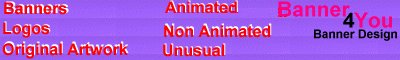
Banner For You specializes in custom graphics. We create affordable, High Quality Banners and we guarantee top of the line original work to all of our clients. Our company is new on the web and we are in the process of expansion.


Services

Services that we offer are graphic design, custom banner, and logo designs, animated banners, icon design, custom backgrounds.


Tips

It's estimated that about 56% of Net Surfers at least sometimes look at the Banner Ads gracing their screens. Your Banner Ad's job is to get their attention and make them click to your Site.

Be gentle with animation. A flashing cursor, or an arrow that changes color (attracting attention) are good. Too much animation will result in a lower click-thru rate. Also keep in mind that the viewer may stop the page from loading before the entire animation has loaded, leaving only the first frame. Be sure that this first frame will get your message across.

CRYPTIC MESSAGEScan improve your click thru rate by about, messages such as "Click Here" with no obvious hint to what's behind your banner can pique a person's curiosity.
not important unless the visitor has real interest in your site QUESTIONS can improve your click thru rate by about, for example "Tired of Running Out of Food?" or "Looking for a Way to Avoid the Phone?" You also can leave a question in the users mind without phrasing your sentence in the form of a question mark: "Better Web Speed Now" leaves a few questions: Better than what? Speed how? Now, as in newly available?

CLEANLINESS: An unreadable banner will get a very low click thru rate, as will a 'busy' banner - overflowing with lots of words or differing images. Many of the top performing banners have less than 6 words, and most of the words are one syllable. Terse and clean.

IMAGES, NOT TEXT: Graphics: A picture is worth a thousand words, but be sure you say what you mean with your images. If you are going to use an image it can save you lots of text on a banner. For example, a couple credit card icons show that you accept credits cards and have something to sell online. Add an image of a computer, and you show yourself as an online computer hardware merchant, without using any words. Add the text like: "Click for best quality", and you are done.

CALL TO ACTION can improve your click thru rate by about 15% , use phrases like "Click Now !"

FREE ! can improve your click thru rate from 6% to 35% , depending on what's offered. Free Software and Hardware offers get the higher responses, while free travel and money offers rank much lower.

BRIGHT COLORS can improve your click thru rate, Blue, Green or Yellow work great.

Here are some tips on what to AVOID:

COLORSsuch as Red, Black and White.

URGENCY tends to turn people off. "Limited time only" and similar phrasing bring below average results. This is not the same as a Call To Action, which asks people to "Click Now"

LACK OF FOCUS results in lower click thru rates. If you have 2 or three different things on your banner, it will lower the click through rate (for example, "Jerodio's Star Wars, Personal Page, and Online Book Shop").

UNREADABLE banners don't get clicked on often. Be sure that your banner looks clear and readable.

Samples